My Semilac
Mobile application for purchasing Semilac products


My Semilac won! Mobile Trends Conference 2024
Numbers
App rating
Greater retention than RWD
Number of downloads
Customers who start finalizing an order finish it with a payment
In-app purchases made by logged-in users
Online transactions carried out via the application
Conversion greater than RWD
Challenge
The number of customers making purchases via e-commerce using mobile devices is growing year by year. The Semilac brand, owned by Nesperta Europe, wanting to meet the expectations of its customers, as well as wanting to build a deeper relationship with them, decided to create a new mobile application that combines the store with social functionalities.
The challenge faced by the Semilac brand was to design a solution tailored to the needs of a modern woman who values the speed and convenience of shopping, which at the same time would inspire her to create various nail designs, care for her hands, deepen her knowledge and develop her skills, and as a result, encourage her to make more frequent and major purchases.
Project parameters
- OKR
- In-depth user interviews
- UI/UX design
- Fast Prototyping
- Persony
- Benchmarking
- User testing
- Expert audit
- Mobile development
- E-commerce integration
- Payment gateway integration
- Scrum
Completed
works
Step 1:
Target identification
business
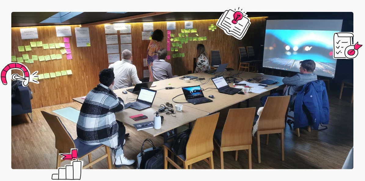
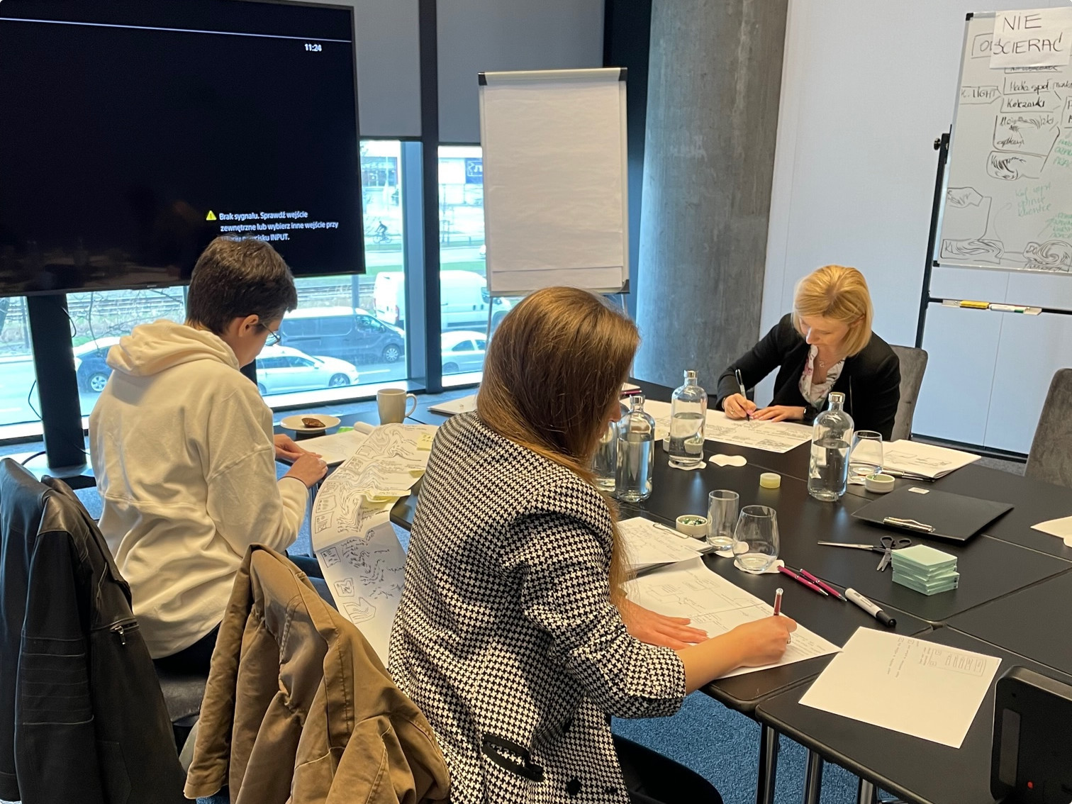
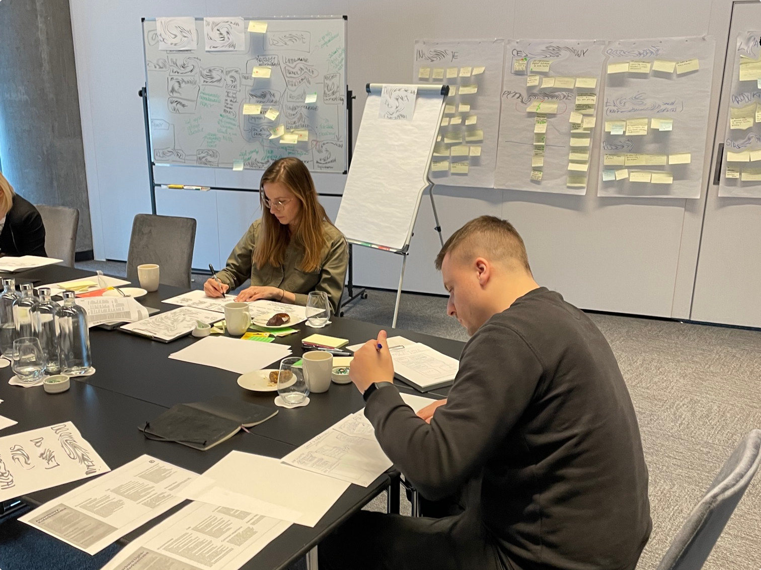
In the first stage of the project, together with Nesperta, we identified business goals and recorded them in accordance with the assumptions of the OKR (Objective-Key Results) methodology. During the workshops, we defined the criteria for achieving the assumed goals, measures to track the progress of their implementation and set priorities. The above activities allowed us to share the understanding of the goals among all project stakeholders. The most important goal set for the new mobile application was to build a deeper relationship between the Semilac brand and customers.
Step 2:
Deepening understanding
users
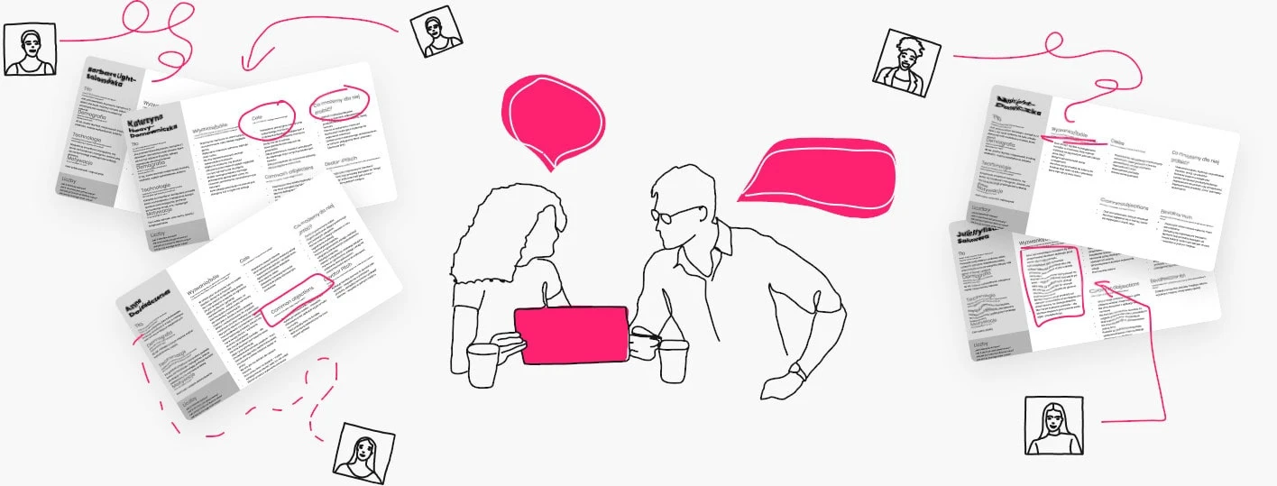
The next step in our process was a better understanding of users’ needs, which in turn allowed us to identify solutions that would increase their brand loyalty. At this stage, we conducted in-depth interviews with representatives of the target groups, during which we identified their needs, goals and pain points. The data from the interviews provided us with the knowledge on the basis of which we developed Personas, thanks to which we could better understand the application’s target groups and determine what we can do for them.
Step 3:
Identification of solutions
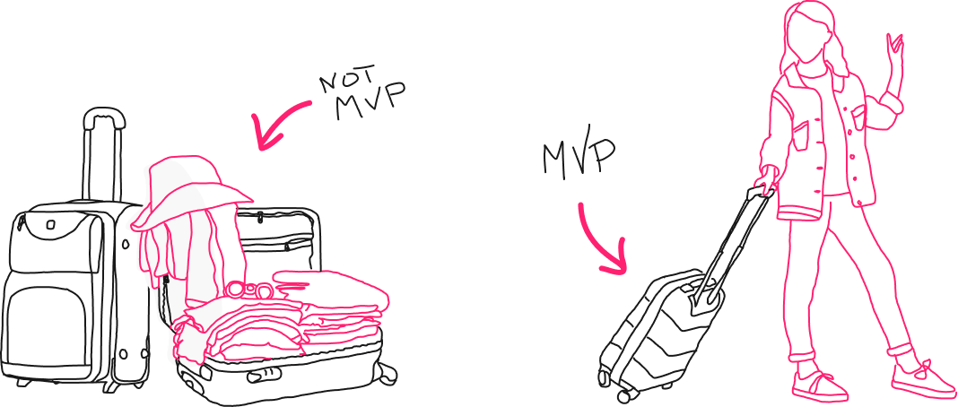
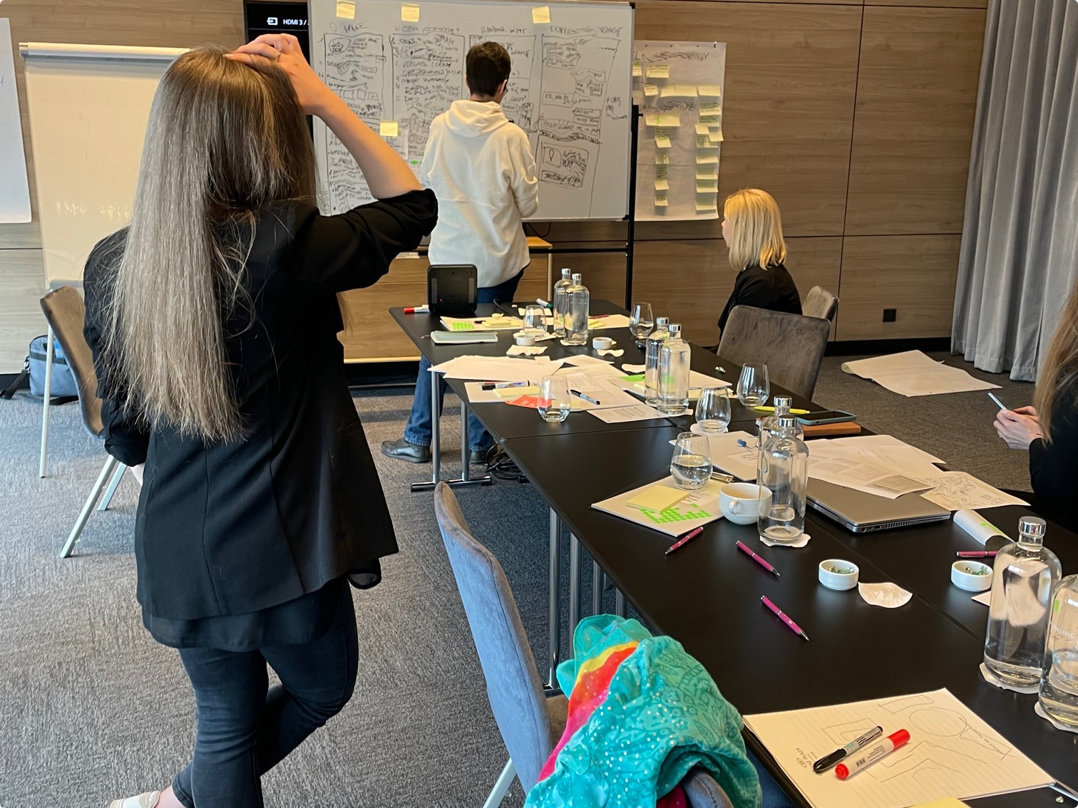
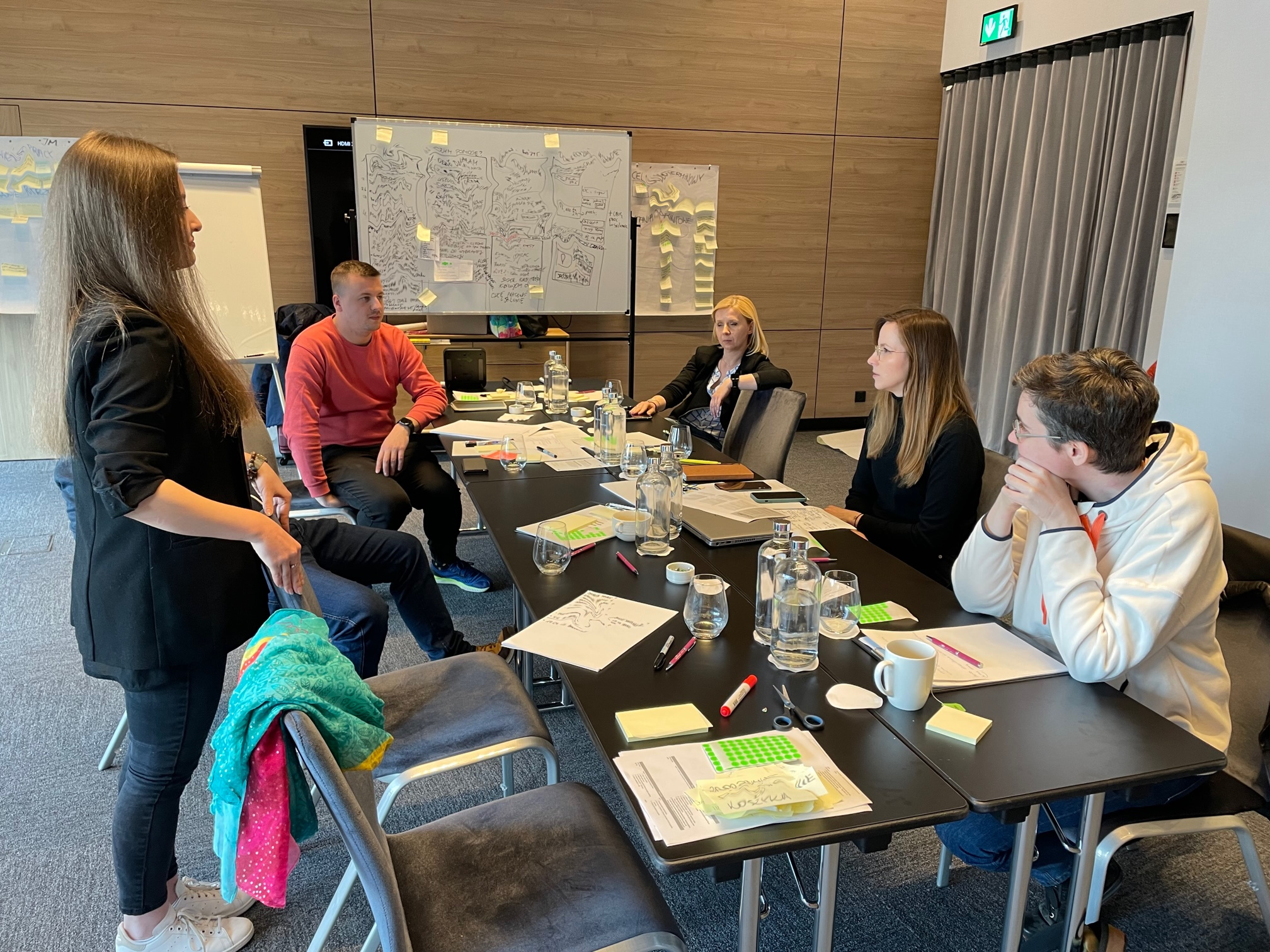
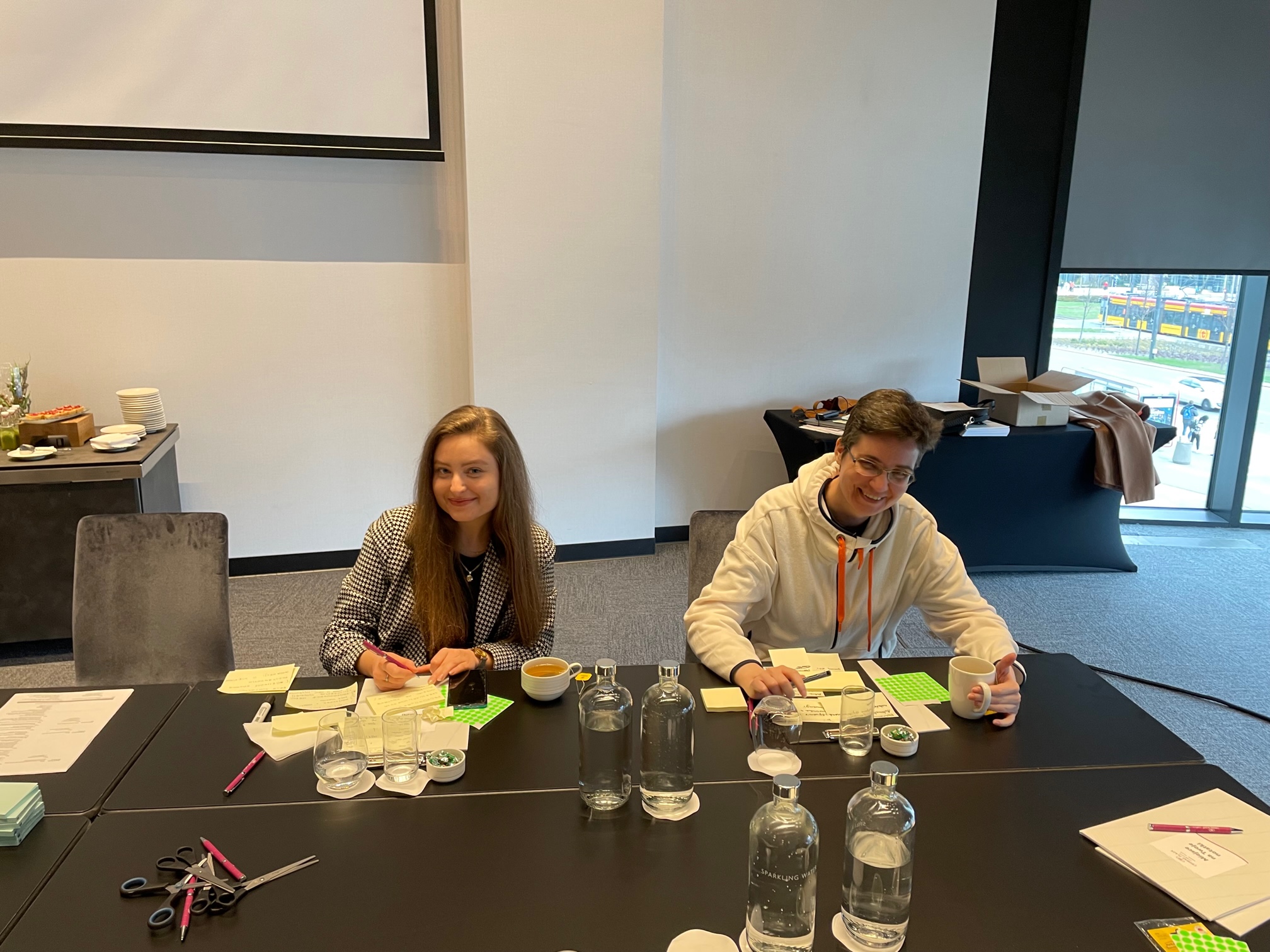
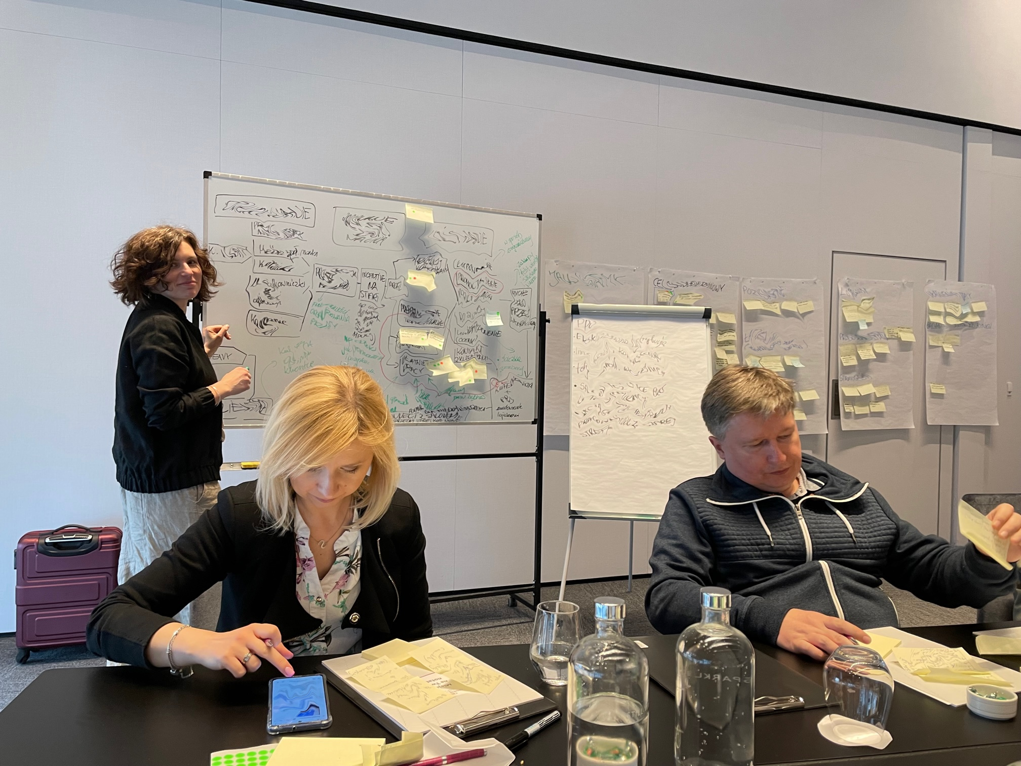
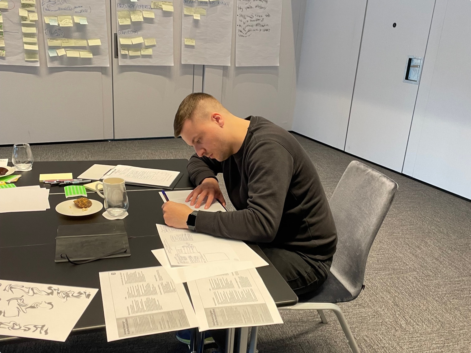
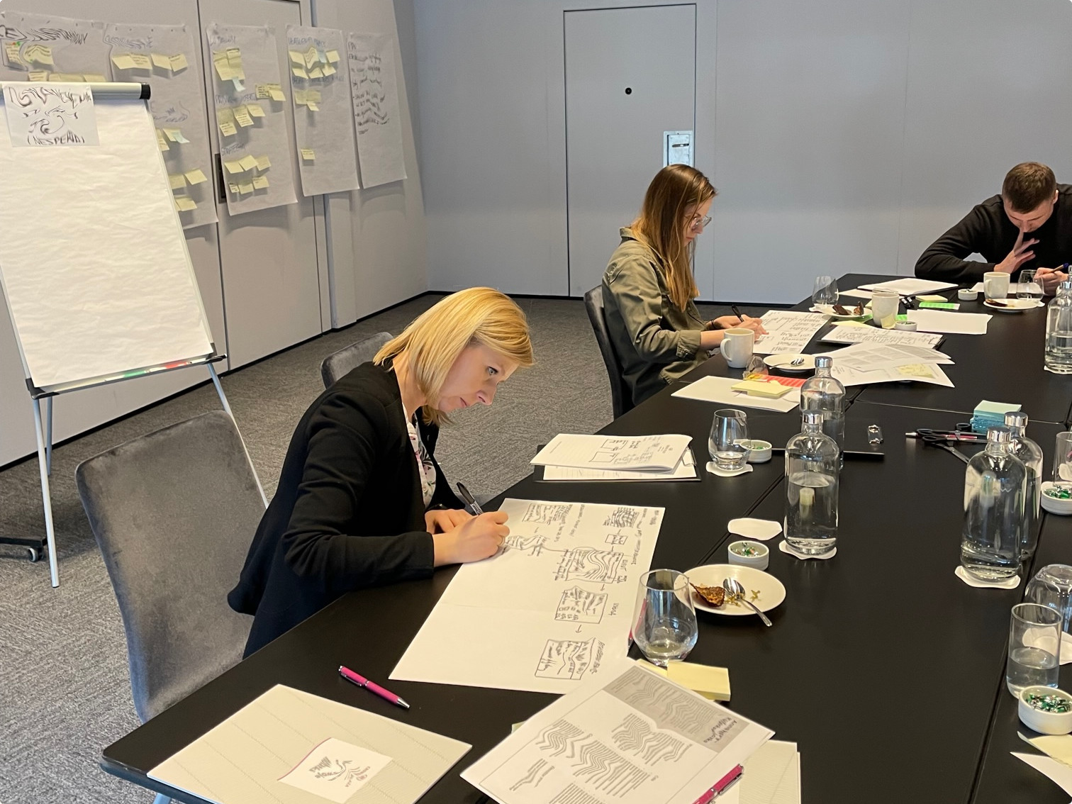
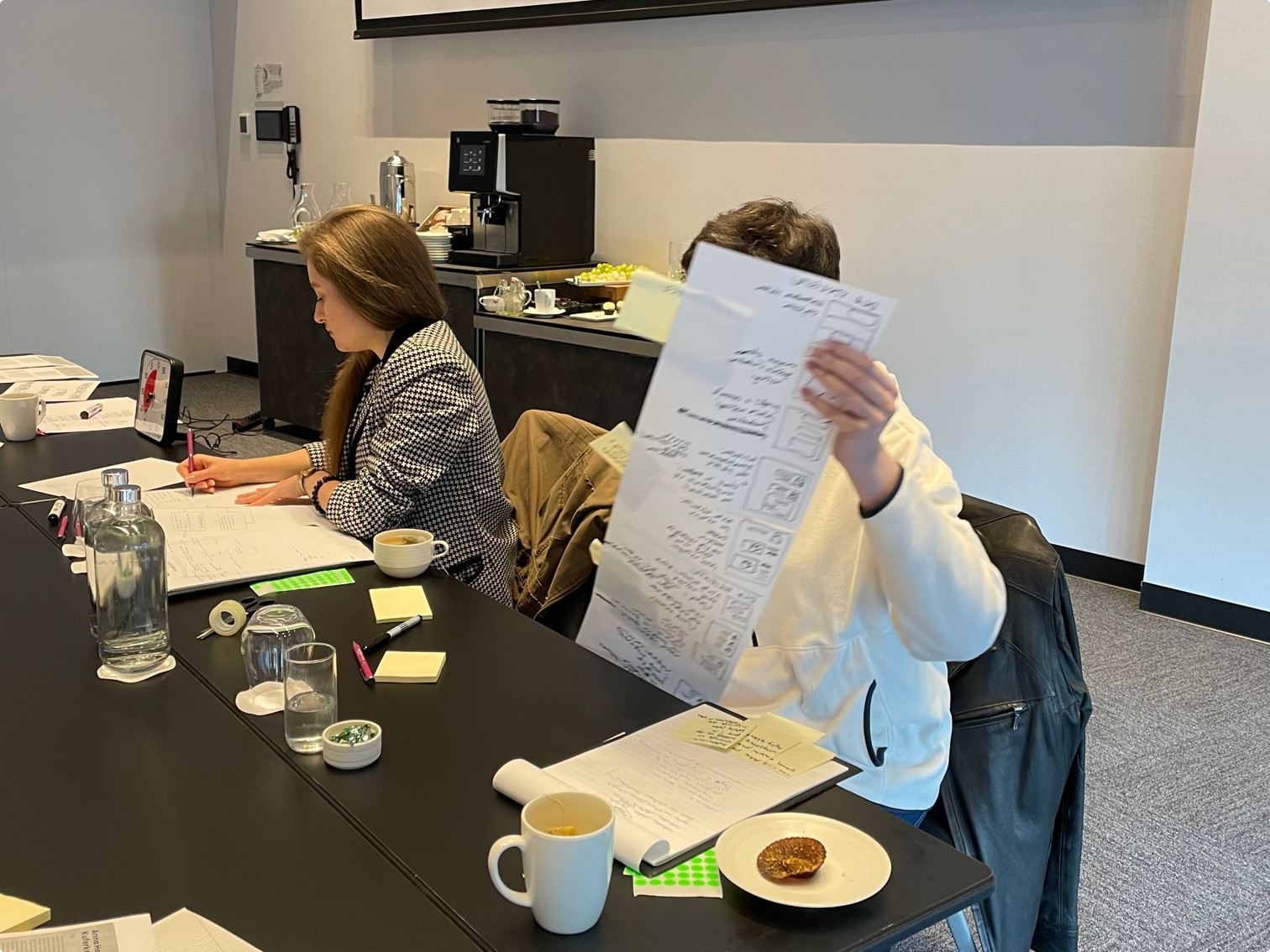
We applied the knowledge gained in the previous stages to the next stage of the process, namely, during Impact Mapping workshops, which identified the solution, its functionalities, and performance. All functionalities were selected to support clients in achieving their goals, support them in making purchasing decisions and making more frequent and larger purchases, and encourage more frequent visits to the app. We related the identified solutions to the goals and established priorities, which allowed us to define the scope of the MVP for the app.
During the workshop, we also took into account the conclusions of the expert audit of the old application and benchmarking, summarizing the trends and solutions used on the market.
Step 4:
Fast prototyping
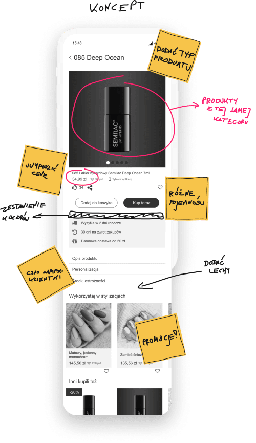
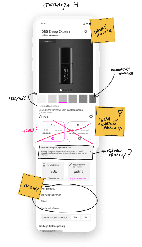
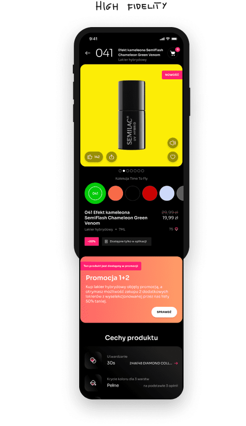
OKRs, Personas and Impact Map are the basis for the next step, i.e. Fast Prototyping. In short, we have created prototypes that illustrate the target solutions and enable the collection of feedback before starting the implementation of the solution. On the basis of medium fidelity prototypes, we prepared a graphic concept and a target user interface design.
The evolution of the screen From the concept to the target project on the example of a product card
Step 5:
Verification of solutions with
users
At this stage, our goal was to verify the assumptions based on a clickable application prototype. Therefore, we conducted tests with users, during which representatives of target groups carried out defined tasks using a clickable prototype of the application. The conclusions from the research allowed for a better planning of the scope of functionalities (e.g. by eliminating defects or misguided solutions) and confirming the chosen priorities. The creation of clickable prototypes of the application and the validation of ideas at the design stage allowed us to minimize the project risk and reduce the costs associated with changes in the application during or after the development phase.
Step 6:
Implementation
Our assumptions from the beginning of the project were high efficiency of the manufacturing process and delivering the effects of our work often and in small portions. This, in turn, enabled the team to verify the created solutions on an ongoing basis, to improve them, and to correct any errors on an ongoing basis.
The implementation of the Scrum framework, including the ongoing management of requirements and their priorities, allowed the team to work in a conscious and controlled manner, which in turn visibly translated into the comfort of work in the project and its predictability.
Static screens
Start animation
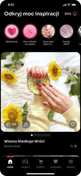
The initial screen - the so-called Feed
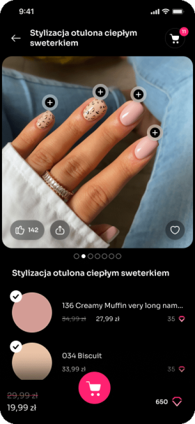
Styling card
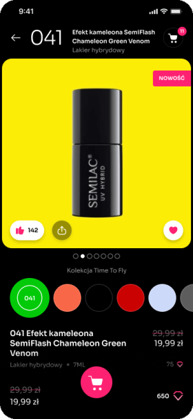
Product card
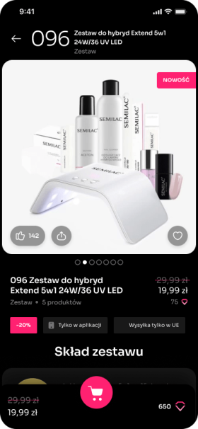
Product card - configurable set
Product catalog
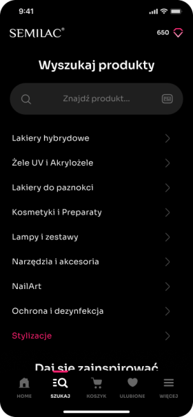
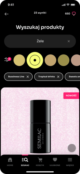
Search engine with filters
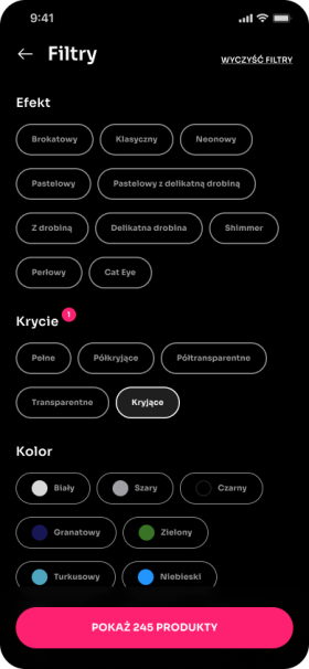
Filters in the product catalog
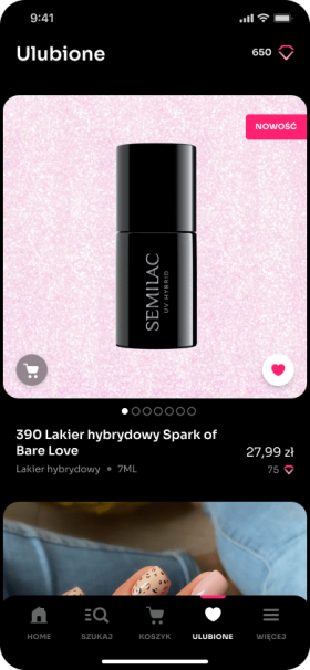
Favorite
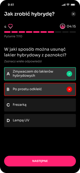
Quizzes
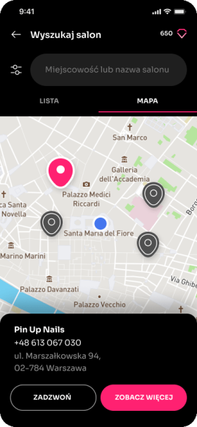
Salon finder
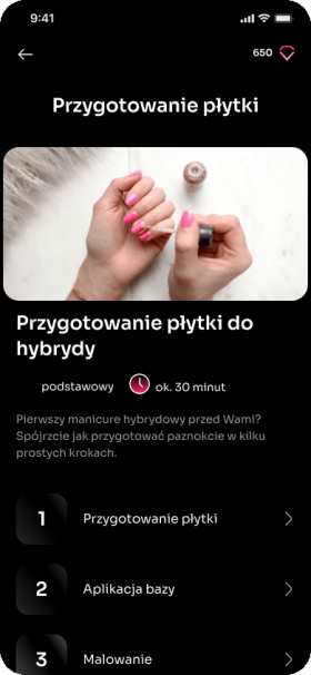
Tutorials
Solution
EO has created the My Semilac mobile application available for iOS and Android platforms, which allows customers to make purchases in a quick and convenient way – with one click.
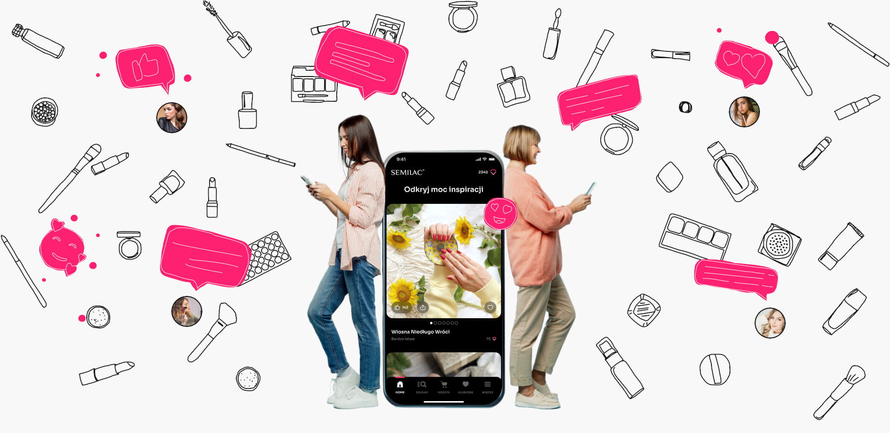
Users have a personalized homepage that provides inspiration and educational materials tailored to their different skill levels and preferences. The application also provides a points program, special discounts and quizzes encouraging customers to visit the application more often and make more frequent purchases. In addition, business customers have access to the Professional section, containing products dedicated to professional use, as well as giving early access to new products. In addition, the application has the option of sharing business cards for salons and stylists to make it even easier for them to reach new clients. The application has been integrated with tools for collecting and analysing data, allowing the best possible adaptation of the offer to the user.
Click Prototype:
Technologies
Flutter
Magento
GraphQL API
Firebase

AppsFlyer

Synerise

